Ever walked into a room and felt like the walls were closing in on you? That’s usually not the furniture’s fault. It’s the paint. Picking the right paint colors for small rooms can genuinely change how a space feels — sometimes more than knocking down a wall would, and for about 2% of the cost.
I’ve repainted three flats in the last six years, two of them tiny 1BHKs in Mumbai and Pune, and I learned this the hard way. My first apartment had a bedroom I painted a deep maroon because I liked how it looked on Pinterest. It looked like a cave within a week. Lesson learned. Let’s get into what actually works.
Why Paint Color Matters More in Small Spaces
Paint colors for small rooms aren’t just about aesthetics — they change how your brain perceives depth and distance. Light bounces differently off pale walls than dark ones, and in a cramped room, every bit of bounced light counts toward making the space feel open.
In a large hall, a bold color is just one design element among many. In a 10×10 bedroom, it’s basically the entire room. There’s nowhere for your eye to rest except the color you chose, which is why the stakes feel so much higher when the square footage is small.
Stick to Light, Cool Undertones First
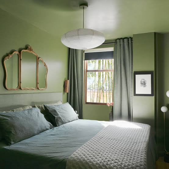
If you’re unsure where to start, cool-toned light colors are close to foolproof. Think soft blues, sage greens, warm whites, and dusty lavenders. These recede visually — meaning the wall seems to pull back from you instead of pressing forward.
A few reliable ones I keep recommending to friends:
- Soft sage green (calming, works well in bedrooms)
- Warm off-white or eggshell (safe, flexible, resells well if you’re renting)
- Pale dusty blue (great for rooms that get harsh afternoon sun)
- Light greige — that grey-beige hybrid everyone’s using in 2026
Avoid stark, cold white though. It can look clinical and actually make a small room feel emptier rather than bigger, which isn’t really the goal here.
Don’t Be Scared of a Bold Accent Wall
Direct answer: One accent wall in a small room, painted a shade or two darker than the rest, can add depth instead of shrinking the space — as long as the other three walls stay light and the accent wall isn’t the one facing the door.
This is where I disagree with a lot of “small room” advice that tells you to keep everything pale. A single wall in a rich color — teal, terracotta, even a deep navy — can actually make a room feel more intentional and layered. It stops the space from looking like an empty box.
Picture a small study room in a Jaipur apartment, maybe 8×9 feet. Paint three walls a warm white, and the wall behind the desk a deep terracotta. Suddenly the room has a focal point instead of just… existing. That’s the difference between a room that feels small and one that feels cozy.
Use the Same Color on Walls and Ceiling
Direct answer: Painting the ceiling the same color (or a slightly lighter tint) as the walls removes the visual “stop line” where wall meets ceiling, tricking the eye into reading the room as taller and more continuous.
This one surprises people. We’re trained to think ceilings should always be white. But in a room with low ceilings — common in a lot of older Indian apartments — a stark white ceiling against colored walls creates a hard line that actually draws attention to how low the ceiling is.
Try this instead: pick your wall color, then ask your painter for the same shade at 50% strength for the ceiling. It’s a small ask but the effect is noticeable.
Mind the Natural Light in the Room
North-facing rooms in India get cooler, flatter light most of the day. South and west-facing rooms get warmer, harsher light, especially in summer. This matters a lot more than people realize when picking paint.
- North-facing room: lean warm (soft yellows, warm greiges) to counter the coolness
- South/West-facing room: cooler tones (blues, sage) balance the heat and glare
- East-facing room: fairly flexible, gets a nice soft morning light
I’ve noticed clients skip this step constantly, then wonder why the “perfect” color from the paint store swatch looks completely different once it’s on their actual wall. Always test a sample patch and look at it morning, afternoon, and evening before committing.
Use Vertical Stripes or Two-Tone Walls for Height
If your small room has decent height but limited floor area, two-tone walls — a darker lower half and lighter upper half, split around chair-rail height — can stretch the room upward visually. It’s an old trick but it still works.
Alternatively, thin vertical stripes (subtle, not circus-tent bold) draw the eye up and down rather than side to side, which makes low ceilings feel taller.
[link to related guide about small space furniture layout here]
Glossy vs Matte Finish Actually Matters Too
People obsess over the color and completely ignore the finish, which is honestly a mistake. Glossier finishes — eggshell or satin — reflect more light and add a subtle sense of depth. Flat matte finishes absorb light and can make walls feel closer.
For small rooms, I’d generally push toward eggshell or satin on walls, and reserve pure matte for ceilings or accent trim only.
Test Before You Commit — Seriously
Direct answer: Always paint a sample patch of at least 2×2 feet directly on your wall and observe it across a full day before finalizing — swatches and paint-store lighting are notoriously misleading for how a color will actually read in your room.
This sounds obvious but almost nobody does it properly. I’ve seen people pick colors off a phone screen. Don’t do that. Screens lie, phone cameras lie, and paint store lighting is designed to make everything look flattering.
[link to related guide about testing paint samples at home here]
A Quick Real-World Comparison
Here’s a rough breakdown of how different color choices performed across three small rooms I’ve personally repainted or consulted on:
| Room Type | Color Used | Perceived Effect |
| 9×10 bedroom | Deep maroon (all walls) | Felt smaller, cave-like |
| 10×10 bedroom | Sage green + white ceiling | Felt noticeably airier |
| 8×9 study | White + terracotta accent wall | Felt cozy, not cramped |
Small sample size, sure. But it lines up with pretty much every professional recommendation I’ve come across since.
[link to related guide about budget home renovation ideas here]
FAQs About Paint Colors for Small Rooms
Q: What’s the single best color for a small room? There isn’t one universal “best” — but soft sage green, warm white, and light greige are the safest bets if you want a small room to feel bigger without playing it too safe.
Q: Should small rooms always be painted white? No, not necessarily. White works, but it can feel cold or clinical. A soft, light color with warmth often performs just as well while feeling more like a lived-in home.
Q: Do dark colors always make a room look smaller? Not always — a single dark accent wall can actually add depth. The mistake is painting all four walls a dark shade with no contrast anywhere.
Q: Does ceiling color really make that much difference? Yes, more than most people expect. Matching or lightly tinting the ceiling to the wall color removes the visual break and makes the room read taller.
Q: How many paint samples should I test before deciding? At least two or three, and always on the actual wall, not a cardboard swatch. Look at them at different times of day before you commit to buying full cans.
Q: Is glossy or matte finish better for small rooms? Eggshell or satin generally works better than flat matte for walls in small rooms, since it reflects a bit more light. Save matte for ceilings or trim.
Final Thoughts
Choosing paint colors for small rooms really comes down to a handful of decisions: go light and cool where you’re unsure, don’t be afraid of one bold wall, match your ceiling to your walls, and actually test your color before you paint the whole room.
None of this needs an interior designer or a huge budget — a couple of sample pots from any local hardware store will get you there. Grab two or three shades this weekend, paint a patch on your actual wall, and live with it for a day before deciding. Your small room will thank you for it.