Home Design Ideas: How to Mix Colors and Textures
Ever put together a room that had all the “right” pieces — nice sofa, decent rug, a few plants — and it still felt flat? That’s usually not a furniture problem. It’s a colour and texture problem.
Good home design ideas almost always come down to contrast: something smooth next to something rough, something warm next to something cool. In 2026, with so many Indian homeowners mixing modern furniture with traditional textiles, getting this balance right matters more than ever. This guide breaks down how to actually do it, not just why it works.
Why Colour and Texture Make or Break a Room
Direct answer: Colour and texture matter because they’re what your eye notices before it registers a single piece of furniture. A room can have expensive furniture and still feel “off” if the colours clash or every surface has the same flat finish.
I’ve walked into plenty of beautifully furnished homes that somehow felt cold. Nine times out of ten, it’s because everything was the same texture — glossy tiles, glossy furniture, glossy curtains. Nothing for the eye to rest on, nothing that invites you to touch it.
Good home design ideas treat colour and texture as a pair, not two separate decisions. They work together, or they fight each other. There’s rarely an in-between.
Start With a Base Colour, Then Build Around It
Pick one dominant colour for your walls or largest furniture piece — this becomes your anchor. Everything else, your accent colours, your fabrics, your accessories, gets chosen in relation to that base, not randomly.
A lot of people skip this step and just buy things they like individually. Then they wonder why the living room looks like five different Pinterest boards collided. Has this happened in your home?
For an Indian context, a warm terracotta or deep indigo wall works beautifully as a base, especially paired with brass and wood accents. If you want something safer, a warm grey or sage green gives you more room to experiment later without repainting.
The 60-30-10 Rule for Mixing Colours
This is one of the oldest tricks in home design ideas, and it still works because it’s genuinely simple: 60% of the room in your dominant colour, 30% in a secondary colour, and 10% in an accent.
Picture a small business owner in Jaipur redoing her home office. She painted the walls a soft off-white (60%), added a navy accent chair and curtains (30%), and threw in a mustard cushion and a couple of brass frames for the final 10%. The room went from “generic” to “intentional” without her buying a single new piece of furniture — just paint and textiles.
A rough breakdown:
- 60% — walls, large furniture, flooring
- 30% — curtains, an accent chair, a large rug
- 10% — cushions, vases, small decor pieces
Layer Textures Before You Worry About Colour Perfection
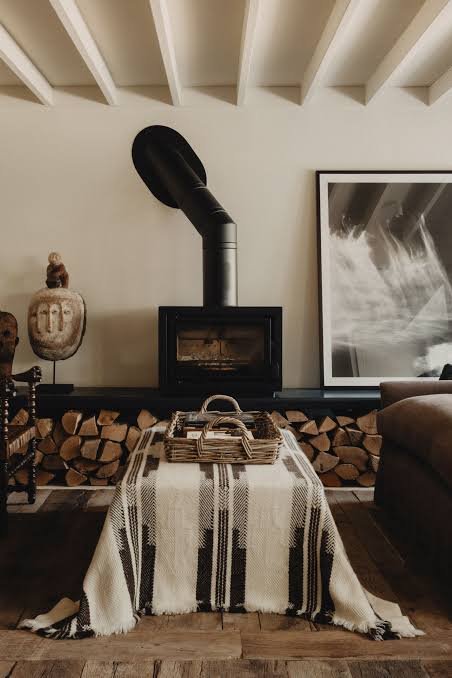
Direct answer: Layering textures means combining rough, smooth, matte, and glossy surfaces in the same room — a jute rug under a leather sofa, or linen cushions against a polished wood table. This adds depth even when the colour palette stays simple.
Honestly, texture does more heavy lifting than people give it credit for. You could keep an entire room in shades of white and still make it feel rich, purely through texture — think a chunky knit throw, a rattan chair, a smooth ceramic vase, and a rough-hewn wooden shelf all in the same space.
A mistake I see a lot: rooms where every fabric is cotton, every surface is matte, nothing has any shine or texture variation. It’s not wrong exactly, just a bit boring. Mix in something reflective — a brass lamp, a mirrored tray — and the room instantly feels less flat.
Use Warm and Cool Tones to Create Balance
Pure warm palettes (all reds, oranges, browns) can start to feel heavy in smaller rooms. Pure cool palettes (all blues, greys, greens) can feel a little sterile if overdone. The trick most good home design ideas rely on is mixing a touch of the opposite temperature in.
A cool grey sofa gets warmed up with a mustard or rust cushion. A warm terracotta wall gets balanced with cool slate-grey ceramics. Even a 10% dose of the opposite tone keeps a room from feeling one-note.
[link to related guide on choosing paint colours for small homes here]
Don’t Ignore Natural Materials
Wood, cane, jute, stone, brass — these materials bring texture and warmth that fabric alone can’t. They also tend to age well, unlike trendy fabric patterns that can look dated in a couple of years.
Rattan furniture has made a big comeback across Indian homes recently, and honestly, I get why — it pairs with almost any colour scheme and adds instant texture without shouting for attention. A cane headboard, a jute door mat, a stone coaster set — small additions, big difference.
Mixing Patterns Without It Looking Chaotic
This is where a lot of home design ideas go wrong in practice. People either avoid patterns entirely (safe, but boring) or throw in five different prints and hope for the best.
A more reliable approach:
- Pick one “hero” pattern — a bold cushion, a patterned rug, whatever draws the eye first
- Add one smaller-scale pattern in a related colour (stripes work well here)
- Keep everything else solid or textured, not patterned
Three patterns max in any single room is a decent rule of thumb, and even that can feel like a lot in a smaller space.
Budget-Friendly Ways to Test Combinations Before Committing
You don’t need to repaint or reupholster to test a colour and texture combo. Buy fabric swatches, or pick up a few cushion covers for ₹300–₹600 each and live with them for a week before deciding.
- Try paint sample pots on a small wall section rather than committing to a full gallon
- Rearrange existing cushions and throws before buying new ones
- Photograph the room in different light — morning and evening light change how colours read
FAQs About Mixing Colours and Textures at Home
How many colours should I use in one room? Three is a safe number — one dominant, one secondary, one accent. Going beyond four or five tends to make a room feel busy rather than curated.
Can I mix warm and cool colours in the same room? Yes, and honestly you should. A small amount of the opposite temperature keeps a room from feeling flat or one-note.
Is it okay to mix patterns and textures together? Definitely, just keep it controlled. One bold pattern, one smaller supporting pattern, and the rest kept solid or textured usually works best.
What’s the easiest way to add texture on a budget? Cushions, throws, and a jute or cane accent piece go a long way without needing a full furniture change. Even swapping curtain fabric makes a noticeable difference.
Do dark colours make small rooms feel smaller? Not always — a dark accent wall paired with good lighting and lighter furniture can actually add depth rather than shrinking the space.
How do I know if my colour palette is too matchy? If everything in the room is nearly the same shade with no contrast in texture or tone, it can start to feel flat rather than cohesive. A little contrast usually fixes it.
Final Thoughts
Mixing colours and textures well isn’t about following one rigid formula — it’s about building contrast on purpose instead of by accident. Start with a base colour, layer in textures, and don’t be afraid to test combinations with something as cheap as a cushion cover before committing to bigger changes.
Pick one room in your home and try the 60-30-10 approach this weekend. Small changes — a new throw, a different curtain fabric — often make a bigger difference than people expect.
Suggested image alt text:
- “Living room with mixed textures showing jute rug and leather sofa”
- “Home design ideas for warm and cool colour balance in bedroom”
- “Terracotta accent wall with brass and wood decor accessories”